

-
Regular price From $8.00 CADRegular priceUnit price per
-
Regular price From $8.00 CADRegular priceUnit price per
-
Regular price From $8.00 CADRegular priceUnit price per
-
Regular price From $8.00 CADRegular priceUnit price per
-
Regular price From $8.00 CADRegular priceUnit price per
-
Regular price From $8.00 CADRegular priceUnit price per
-
Regular price From $8.00 CADRegular priceUnit price per
-
Regular price From $8.00 CADRegular priceUnit price per
-
Regular price From $8.00 CADRegular priceUnit price per
-
Regular price From $8.00 CADRegular priceUnit price per
-
Regular price From $8.00 CADRegular priceUnit price per
-
Regular price From $8.00 CADRegular priceUnit price per
-
Regular price From $8.00 CADRegular priceUnit price per
-
Regular price From $8.00 CADRegular priceUnit price per
-
Regular price From $8.00 CADRegular priceUnit price per
-
Regular price From $8.00 CADRegular priceUnit price per
-
Regular price From $8.00 CADRegular priceUnit price per
-
Regular price From $8.00 CADRegular priceUnit price per
-
Regular price From $8.00 CADRegular priceUnit price per





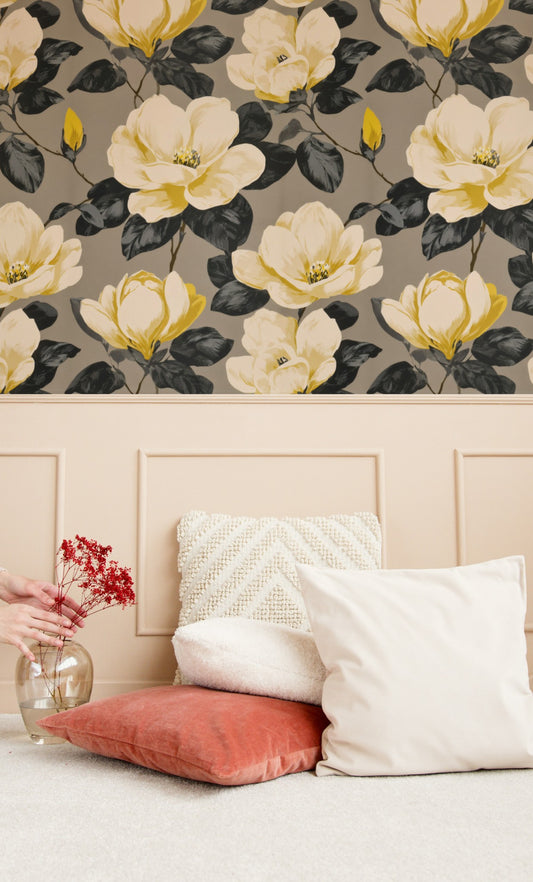

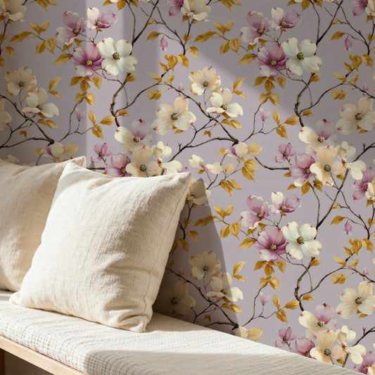


Choosing neutral wallpaper
Where it works
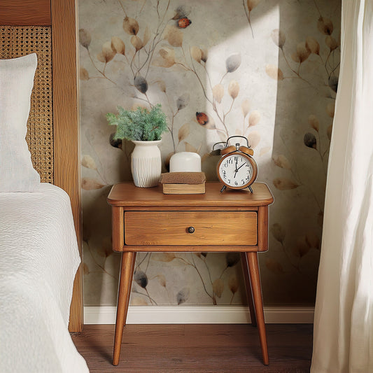
Neutrals earn their keep in the rooms that have to stay calm while the rest of the house keeps changing. A rented flat. A home office. A landing, or a bedroom you'd like to wake up in without a jolt. Behind a bed we'd go softest first, so Trailing Rose or Taupe Blossom, white blossom on greige. Sketched Pines is a loose row of conifers on off-white (fine in a hallway, and in a child's room it doesn't look babyish). Sepia citrus on cream is Orange Grove, which we'd hang in a kitchen, near the kettle. Then Indigo Cardinal, darker, on flax linen. It holds a whole dining room with no real colour in it.
Picking between the designs
Warm or cool comes first. Golden Branch, the one with the yellow apples, sits on the warm side with Orange Grove. Cool means Graphite Magnolia, or Trailing Roses over a faintly damasked grey. After that it's about how much drawing you want to live with. Orange Grove and Golden Branch are fine pen line with a lot of bare ground between the branches, while Speckled Pods and Trailing Rose fill more of the wall. Indigo Cardinal doesn't really fit either camp. It's a block-printed bird in indigo and antique gold and it looks like an old textile, so we'd give it wood floors and linen curtains.
Related
The palest ones cross over into cream wallpaper and white wallpaper, the greyer ones into grey wallpaper. Texture instead of drawing is a different route (grasscloth), and our grasscloth guide covers what it is and how it goes up.