


What Is Art Deco Interior Design?
Art Deco interior design is glamour with straight edges: streamlined geometric forms, bold saturated color, luxe materials, and a strong sense of symmetry, all adding up to rooms that feel modern and self-assured. It broke out in the early 1920s and owned fashionable interiors through the 1930s. The name comes from the 1925 Paris Exposition Internationale des Arts Decoratifs et Industriels Modernes. If you want the icons: the Chrysler Building lobby in New York, London's Hoover Building, and the first-class rooms aboard the ocean liner Normandie are all pure Art Deco.

Below we cover what makes an interior Art Deco, how to decorate one, the defining elements, the materials and colors, the history, the styles that pair well with it, and how Art Deco differs from Art Nouveau.
What is Art Deco interior design?
Art Deco interior design is a total style that controls every element of a room: walls, floor, ceiling, furniture, lighting, decorative objects, and architectural details. Nothing gets to wander off and do its own thing. The geometry on the wallpaper comes back in the rug, and the bold green on the walls turns up in the chairs. Luxurious material and decorative symmetry follow the same rule, since the point is one unified, glamorous effect. So the layered eclecticism of a Victorian interior is out, and so is the casual contemporary mix.
An Art Deco room pulls your eye toward the ceiling, and that's the skyscraper's doing. It fits a style that was in full swing while the Chrysler Building went up in New York between 1928 and 1930. Furniture runs tall and slim. Stripes go vertical, and stepped pyramid forms climb in tiers. The curves came from somewhere else: ocean liners and automobiles, machines built to move, which is why a room where nobody has shifted a chair all evening still looks streamlined.
Contrast is the other half, and you feel it before you see it. Run a hand along a cabinet and cold polished chrome stops dead at the ebonized wood. Cream lacquer sits up against black leather, and marble runs straight into gold leaf. They're chosen to disagree (on purpose), and that's where an Art Deco room gets its graphic edge.
We don't think the style works halfway. One sunburst mirror in an otherwise farmhouse kitchen won't make the kitchen Art Deco. It just makes the mirror look lost. A room that's only partly Art Deco usually reads as confused, so we'd commit to the full vocabulary or pick another style. The rooms people still point to, the Chrysler Building lobby and the first-class rooms on the Normandie, were all-in.
What makes an interior Art Deco?
Streamlined geometric forms are the central identifying feature. Art Deco furniture outlines stay clean, and the ornament gets pushed into the details, where diamonds and fans show up. Look longer and you'll find sunbursts and octagons. Stepped pyramids, too. The curves are mathematical ones you could plot on graph paper (the arc of a circle, the parabola of an aircraft wing), nothing like the flowing organic curves of Art Nouveau.
Color gives it away almost as quickly. Black and white set the background, and chrome silver joins them. Over that go the saturated accents. Emerald green and sapphire blue are two, ruby red and mustard yellow two more. Chartreuse green is for the brave. It's a high-contrast, confident palette with no room for the muted earth tones of contemporary design.
Materials can tip you off before the shapes do. Ebony wood with ivory inlay is the old-money version. Polished chrome turns up beside marble, with brass never far off. Lacquer and leather are everywhere. So are exotic veneers. Even budget Art Deco leans on material contrast to suggest luxury within its means.
Check the placement next. Decorative symmetry organizes the room, so furniture comes in matched pairs, like two matching chairs flanking a sofa or a pair of matching lamps on a sideboard. Patterns are bilaterally symmetric too. Fold an Art Deco room down the middle in your head and the halves should match, and that's where the formal, balanced feel comes from.
Then the motifs, which you'll spot on everything from wallpaper borders to door handles. The sunburst is the loudest, rays fanning out from a central point. The stepped pyramid's geometric steps point to Egyptian and Aztec architecture. A fan is a semicircular decorative shape. The chevron? A zigzag.
How to decorate an Art Deco room?
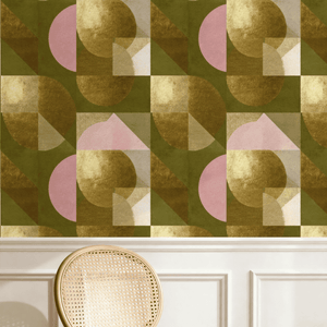
Start with the wall treatment. Bold geometric wallpaper is the obvious choice, usually with metallic gold or silver accents. Paint means one saturated color on every wall, and our pick would be forest green or navy, though oxblood and charcoal suit the style just as well. Or line it in vertical wood paneling, stained dark or ebonized, for built-in vertical emphasis.
The rest makes more sense in a real room: a 12-by-14-foot dining room with a fireplace on the long wall. We'd paper it in a bold geometric with gold in the pattern. The light over the table comes next, and in an Art Deco room it's a primary design element, not an afterthought. A chrome chandelier is our pick. A frosted glass and brass ceiling light would do the job, and so would a series of geometric pendant lights. Two matching lamps on the sideboard add light at a lower height. Over the fireplace goes a large mirror, since Art Deco interiors love mirrors, and it'll spread the chandelier's light while throwing the geometric paper back at you. (No fireplace? Small mirrored panels or a mirrored screen do the same.)
Furniture is where the budget gets tested. Original Art Deco pieces are collectible and expensive, but reproductions and contemporary Art Deco-inspired pieces work equally well. Shop for a streamlined silhouette in dark wood or lacquer. Then check for leather or velvet upholstery and a little chrome or brass detailing.
Objects let you anchor an Art Deco room without committing every surface to the style. On that sideboard, a large geometric vase would do it alone, or a sunburst clock could. An Art Deco-style sculpture works too. We'd leave a chrome cocktail shaker out, with a few lacquered storage boxes nearby.
Finish with a bold Art Deco rug in geometric pattern and strong colors that complement the room's main palette. Chevrons and fan motifs are typical, sunbursts too. Originals are expensive here as well, and a contemporary geometric rug works equally well (it's a lot less nerve-racking under a dining table).
What are the defining elements and characteristics of Art Deco interior design?
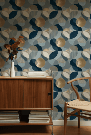
Geometric pattern is the most defining decorative element. It covers wallpaper and rugs, and it runs through textiles and decorative borders too. Most of it is built from diamonds and fans, or sunbursts and octagons, and stepped pyramids and chevrons come from the same family. A committed Art Deco room barely has a surface without it.
Bold saturated color sits right behind it. The leading Art Deco colors for 2026 are forest green and oxblood red, with navy blue close by. Chartreuse green has its place, and so do charcoal and warm black. Gold and silver accents pair with every one of those base colors (copper does too).
Luxury shows up at every price point. At the top end it's ebony and ivory, or marble and gold leaf. Exotic veneers too. On a budget, chrome plating and lacquer finishes carry the load. Even decorative laminate gets a look in. Both read as Art Deco anyway, thanks to material contrast.
Symmetry is next. Furniture goes in pairs and patterns get arranged symmetrically, right up to whole bilateral compositions. That gives Art Deco interiors their formal, balanced quality, and it sets them apart from the asymmetric Art Nouveau style that came before.
Watch for vertical lines in Art Deco furniture and architectural details, too. Tall slim cabinets on slim tapered legs pull your eye upward. So do vertical pattern repeats and stepped decorative borders, all of it echoing Art Deco skyscraper architecture.

What are the most common Art Deco patterns?
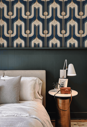
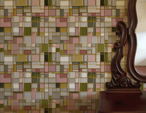
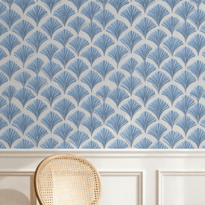
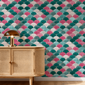
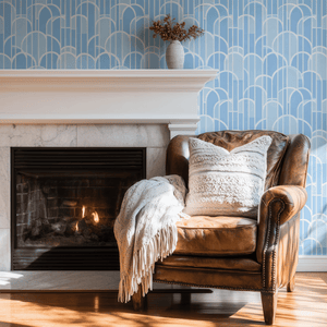
The most common Art Deco patterns are the sunburst, the chevron or zigzag, the fan (often repeated as a scallop), and stepped shapes taken from ziggurats and skyscraper setbacks, usually drawn in metallic lines on a dark or cream ground.
New York's zoning code did a lot of the drawing. After 1916 a tall building had to step back from the street as it climbed, so towers went up in tiers like a wedding cake, and designers lifted that stepped outline straight onto radiator grilles and mirror frames (the top of a wardrobe, too). William Van Alen gave the Chrysler Building a crown of stacked arches that open out like a sunrise. Then in November 1922 Howard Carter broke into Tutankhamun's tomb, and for a few years lotus and papyrus got onto nearly everything, brooches and cinema fronts included.
We have a soft spot for the fan. Line a few up in rows and you've got a scallop, little half circles stacked like fish scales, which is why bathroom tile loves it. The chevron is the show-off. A zigzag band says speed, the same trick a comic artist pulls with motion lines, and the streamlined thirties leaned on it hard.
On a wall it mostly comes down to size. Keep a fan small, gold on navy, in a powder room, and the room glows. A sunburst blown up behind a bed is another animal. We'd allow it one wall, no more.
What materials and colors are commonly used in Art Deco interior design?
Art Deco materials divide into structural and decorative categories. The structural ones are the parts you could knock on. Rap the sideboard and it's ebony or dark stained wood, with lacquer on the cabinet doors. The handle that's cold in your palm is polished chrome. Marble covers the floor and the bathroom surfaces.
The decorative layer is what you notice once you lean in. Ivory inlay and mother of pearl live there. So do the exotic veneers: zebrawood and ziricote are two, macassar ebony a third. Brass and copper bring warmth, gold leaf some glow, and the room gets richer without its structure changing at all.
Upholstery has rules of its own, and your hands find them first. Leather is the classic, usually oxblood or chocolate brown (black works too). Velvet in a saturated color sits happily next to silk, and so does wool. If a chair arm doesn't feel as luxurious as it looks, it's wrong.
The color palette runs on the same logic, bold saturated color against neutral backgrounds. In a small dining room we'd paint the walls oxblood over a black and white marble floor and leave the ceiling cream. Not an oxblood person? There are three greens instead (forest and emerald, or chartreuse for bite), plus ruby red. Navy and sapphire cover the blues, and mustard yellow is the outlier. Ivory can stand in for the cream, and charcoal or warm black will take a room darker.
Metallics are the part Art Deco can't do without. Gold and silver are the obvious pair. Chrome is the modern one, with copper and bronze in support. Switch on a lamp in that oxblood room and the metal throws a shimmer back, and that's the glamour. On a tight budget we'd buy one small metallic accent first, since that alone can tip a room toward Art Deco.
What is the history of Art Deco interior design?
Art Deco emerged in the early 1920s as a reaction against both Art Nouveau decoration and the destruction of World War I. The name comes from Paris, which in 1925 hosted the Exposition Internationale des Arts Decoratifs et Industriels Modernes, a single major exhibition that gathered the leading European decorative arts and architecture in one place.
By the late 1920s it was spreading fast, and New York put it on the skyline. The Chrysler Building went up between 1928 and 1930 with Art Deco architectural details, and the Empire State Building followed in 1930-1931. London's landmark was the Hoover Building of 1933, which became the most famous British Art Deco industrial building. At sea, first-class passengers on the Normandie (1935) and the Queen Mary (1936) traveled in elaborate Art Deco interiors.
The peak came in the mid-1930s, and Hollywood did a lot of the carrying. Film sets used Art Deco interiors extensively, which is how American mass audiences met the style: at the cinema. Department stores adopted it for both architecture and merchandising. Hotel ballrooms used it, and so did restaurant dining rooms. Around the world, movie palaces went Art Deco too.
Then the Second World War ended Art Deco's dominance. Wartime austerity pulled public attention away from decorative luxury. After the war, mid-century modern and atomic-age design swapped Art Deco's bold confidence for quieter modernist forms.
Still, it kept coming back, with several revivals since 1950. The 1970s brought a major revival in fashion and graphic design (interior decoration got one too), and in the 1980s the postmodern movement drew on Art Deco motifs. The current wave has been steady since around 2018. In 2026 it's still going, as part of the broader maximalist mood.
What design styles work well with Art Deco?
Hollywood Regency works particularly well with Art Deco. It's the one we'd try first. The two grew up side by side (Hollywood Regency is mid-twentieth-century) with the same glamour and nerve, so an Art Deco armchair can move into a Hollywood Regency room without anyone blinking. Lamps and decorative objects travel just as easily.
Mid-century modern needs more handling. The overlap is real, since both lean on streamlined forms and neither is shy about bold color or material contrast. We'd let Art Deco hold the architectural and decorative anchors and give the furniture and upholstery to mid-century modern.
Contemporary maximalism is the easiest modern match. It already runs on bold pattern and color, so Art Deco's confidence suits it. A maximalist room can take Art Deco wallpaper with a geometric rug in front of it. Add a statement light over the pair and it still doesn't look confused (a quieter room might).
Egyptian Revival and Aztec Revival motifs get a pass for a historical reason: both fed into Art Deco when it was new. A hieroglyph-inspired pattern near a stepped pyramid form reads as Art Deco-compatible, not as a theme party, and an Aztec-inspired geometric motif slots in beside them.
Two pairings we'd keep out entirely. First, heavily traditional Victorian or country-house decor. The clash is built in, since Art Deco was specifically a rejection of nineteenth-century decorative excess, and a sunburst mirror over a fussy Victorian side table shows it straight away.
Art Nouveau is the second, which surprises people, given how decoratively related the two styles are. Its flowing curves keep arguing with Art Deco's strict geometry whenever they share a room. Pick one and commit.
What is the difference between Art Deco and Art Nouveau?
The styles emerged in different decades. Art Nouveau had its moment first, getting going in the 1890s and peaking through the 1900s. By 1914 it had largely gone out of fashion. Art Deco didn't arrive until the early 1920s, once the First World War was over, and it stayed on top right through the 1930s. Put the two side by side and they're hard to confuse.
Start with something your hand already knows, a door handle. The Art Nouveau one curves like a stem. Your fingers follow the bend, and that bend is the whole style in miniature: flowing organic curves, natural forms stylized a little. Its Art Deco cousin is all straight lines and streamlined geometry. If it carries any ornament, expect a fan shape or a stepped pyramid.
Then there's subject matter. Around 1900, designers turned to nature and the human figure, so plants and flowers are everywhere. You'll find the odd insect, and women with long flowing hair appear again and again. By the 1920s they were looking up at skyscrapers. They studied streamlined ocean liners too, and automobiles. Egyptian and Aztec geometric motifs went into the mix, and when a person appeared, it was a jazz-age figure caught in an angular pose.
Composition settles it. Art Nouveau is asymmetric at heart, and on a strip of its wallpaper the stems lean wherever they like. Art Deco won't have that. It sticks to strict symmetry, bilateral (two matching lamps) or radial (a sunburst), and we'd run a room on the same logic: if one end of the mantel gets a lamp, the other end gets its twin.
The What Is Art Nouveau guide covers Art Nouveau in detail.
Art Deco interior design questions
What is Art Deco interior design?
Art Deco interior design uses streamlined geometric forms, bold saturated colors, luxurious materials, and decorative symmetry to create rooms that read as glamorous, modern, and confident. It belongs to the 1920s and 1930s, and our favorite place to see it is the Chrysler Building lobby in New York.
What colors are Art Deco?
Forest green, oxblood red, navy blue, sapphire blue, mustard yellow, emerald green, ruby red, and chartreuse green appear as accent colors. Eight is a lot, so in practice one carries the room over black and white. Cream or ivory will soften that base, and charcoal or warm black take it darker. On a dining wall we'd go forest green with gold, then let silver or chrome (copper too) handle the rest of the metal.
What materials are used in Art Deco?
Ebony and dark stained wood, polished chrome, marble, lacquer, ivory inlay, exotic veneers (zebrawood, macassar ebony), brass, copper, gold leaf, leather, velvet, and silk. You won't need most of them. Contrast and texture count as much as the materials do, which is why chrome plating against a lacquer finish still reads as Art Deco on a budget.
When was Art Deco popular?
Art Deco emerged in the early 1920s, took its name from the 1925 Paris Exposition, and dominated fashionable interior design through the 1930s. The Second World War stopped it. It came back in the 1970s and again in the 1980s, and the latest revival, under way since about 2018, is still running in 2026.
Where can I buy Art Deco wallpaper?
The William Morris Wallpaper collection at williammorriswallpaper.co carries Art Deco-influenced wallpapers in geometric and metallic categories. We'd start with the Art Deco wallpaper collection, though, since it narrows the range to the Deco designs (the full catalog is a long scroll).


